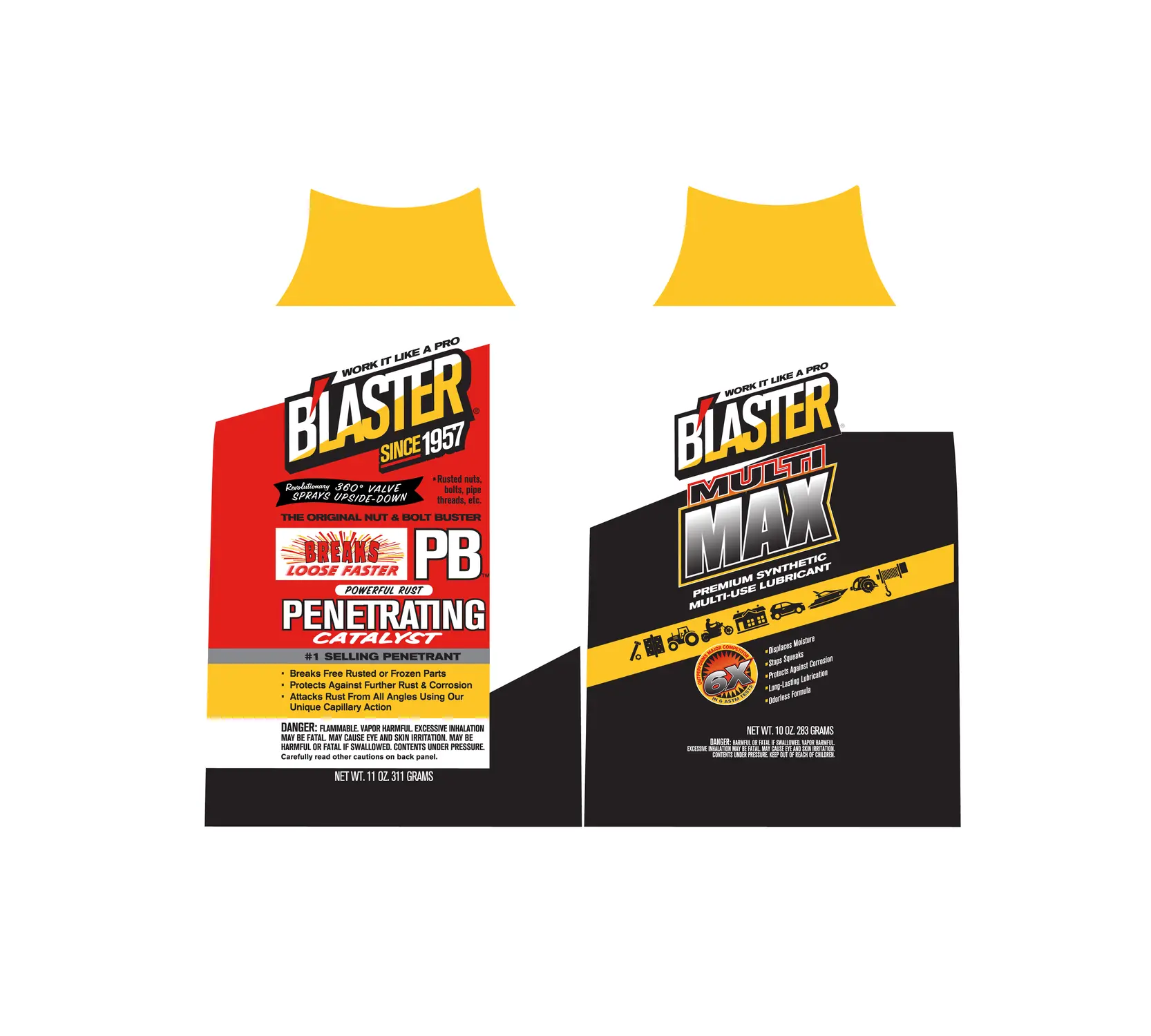
Blaster Product Labels
A bold industrial label family designed for fast recognition across related product variants.
 10 / MULTIVERS CREATION
FROM BRIEF
TO FINAL
IMPACT.
THE ASK.
A bold industrial label family designed for fast recognition across related product variants. The brief was to make Blaster Product Labels feel distinctive, useful and unmistakably connected at every touchpoint.
THE FRICTION.
Make the product easy to recognise, easy to understand and strong enough to compete at shelf distance.
THE IDEA.
We connected pack architecture, information hierarchy and product personality into one system that works as a single design and as part of a wider range.
THE RESULT.
A confident packaging system that makes product information clearer while building stronger visual recognition.
EVERY FORMAT.
ONE STORY.
Large campaigns are organised by format instead of being placed in one endless gallery. Posters, banners, reels, OOH and book collateral can each become a focused chapter while staying inside the same project story.
WHAT WE
CREATED.
- 01Pack architecture
- 02Label design
- 03Information hierarchy
- 04Production artwork
HOW THE
CAMPAIGN
CAME TO LIFE.
Audit
Review the category, pack constraints and purchase context.
Signal
Choose the visual cues that must lead at shelf distance.
Systemise
Build a repeatable hierarchy for copy, variants and claims.
Finish
Prepare a precise, production-aware final presentation.