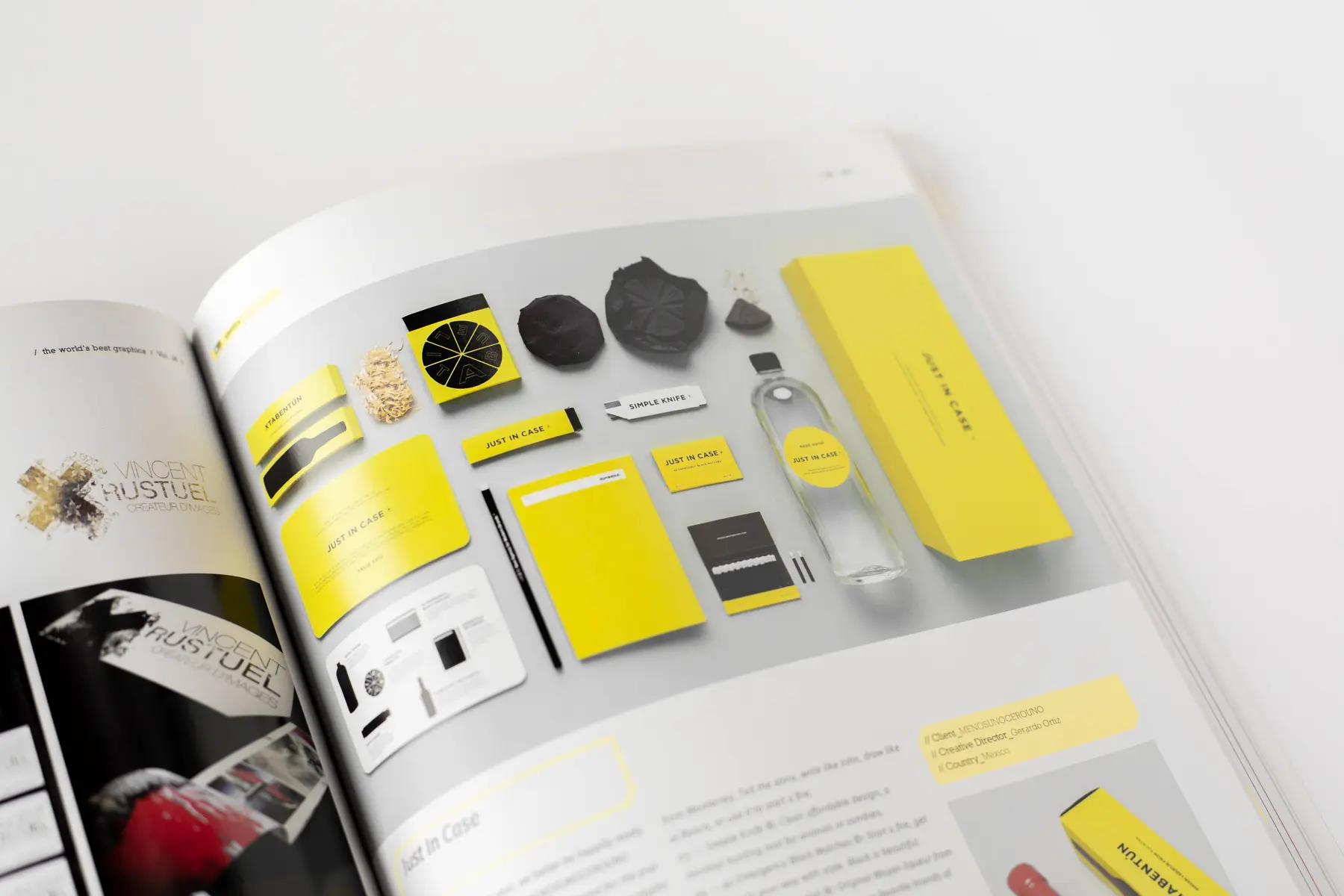
Visual Identity Toolkit
A coordinated identity toolkit connecting colour, typography, layout and application rules.
 07 / MULTIVERS CREATION
FROM BRIEF
TO FINAL
IMPACT.
THE ASK.
A coordinated identity toolkit connecting colour, typography, layout and application rules. The brief was to make Visual Identity Toolkit feel distinctive, useful and unmistakably connected at every touchpoint.
THE FRICTION.
Create a distinctive identity that stays consistent across real-world applications without becoming rigid or repetitive.
THE IDEA.
We built one clear visual language, then tested its typography, colour, hierarchy and composition across the formats people would actually encounter.
THE RESULT.
A recognisable identity system with enough structure for consistency and enough flexibility to grow with the brand.
EVERY FORMAT.
ONE STORY.
Large campaigns are organised by format instead of being placed in one endless gallery. Posters, banners, reels, OOH and book collateral can each become a focused chapter while staying inside the same project story.
WHAT WE
CREATED.
- 01Creative direction
- 02Identity system
- 03Application design
- 04Brand-ready artwork
HOW THE
CAMPAIGN
CAME TO LIFE.
Discover
Clarify the audience, context and strongest point of difference.
Define
Translate the strategy into a focused visual direction.
Build
Develop the core identity and its working design rules.
Apply
Prove the system across the final brand touchpoints.