WHERE
LEARNING
MEETS PLAY.
A complete communication world for India's creative career festival—built from the first announcement to the final venue sign.
Explore the full system
ONE SHOW.
MANY WAYS
TO DISCOVER.
Edutainment Show brings creative careers, workshops, speakers and industry conversations together. The identity needed to feel youthful and energetic, while organising a dense programme with the clarity expected from a serious education platform.
SMART.
BRIGHT.
ALWAYS MOVING.
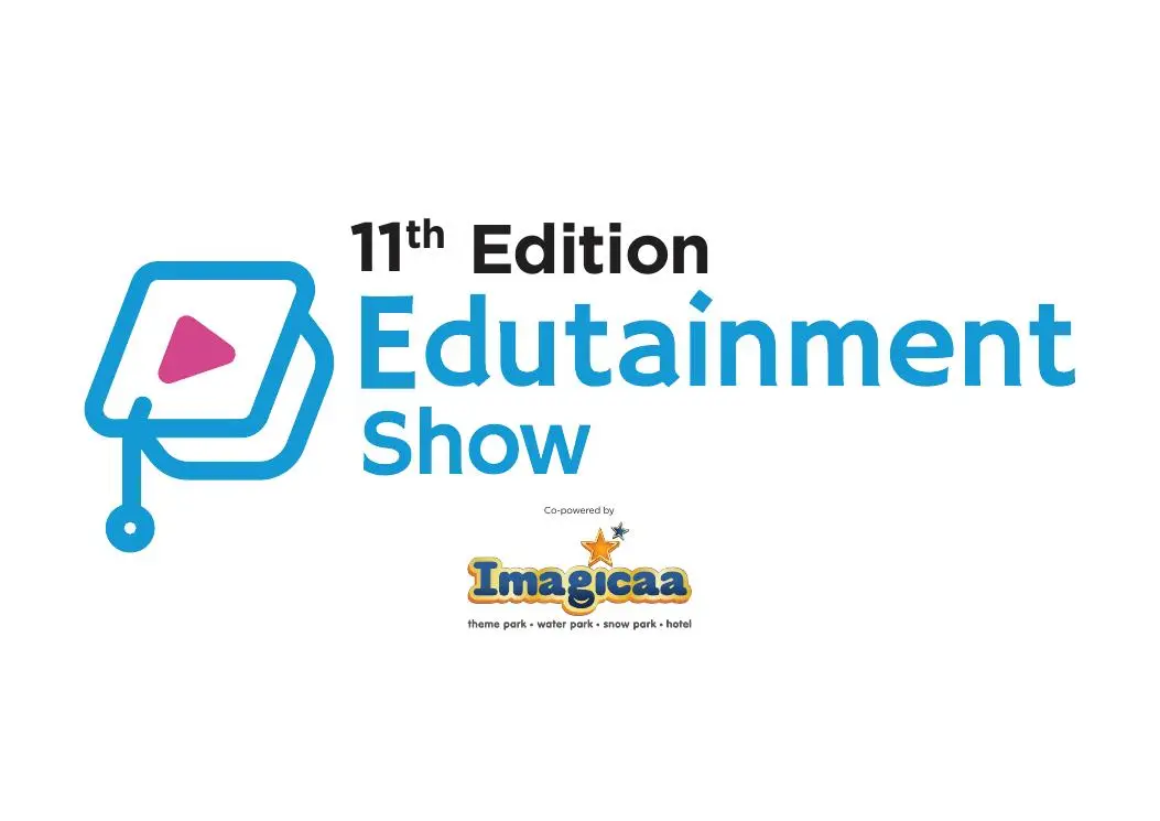
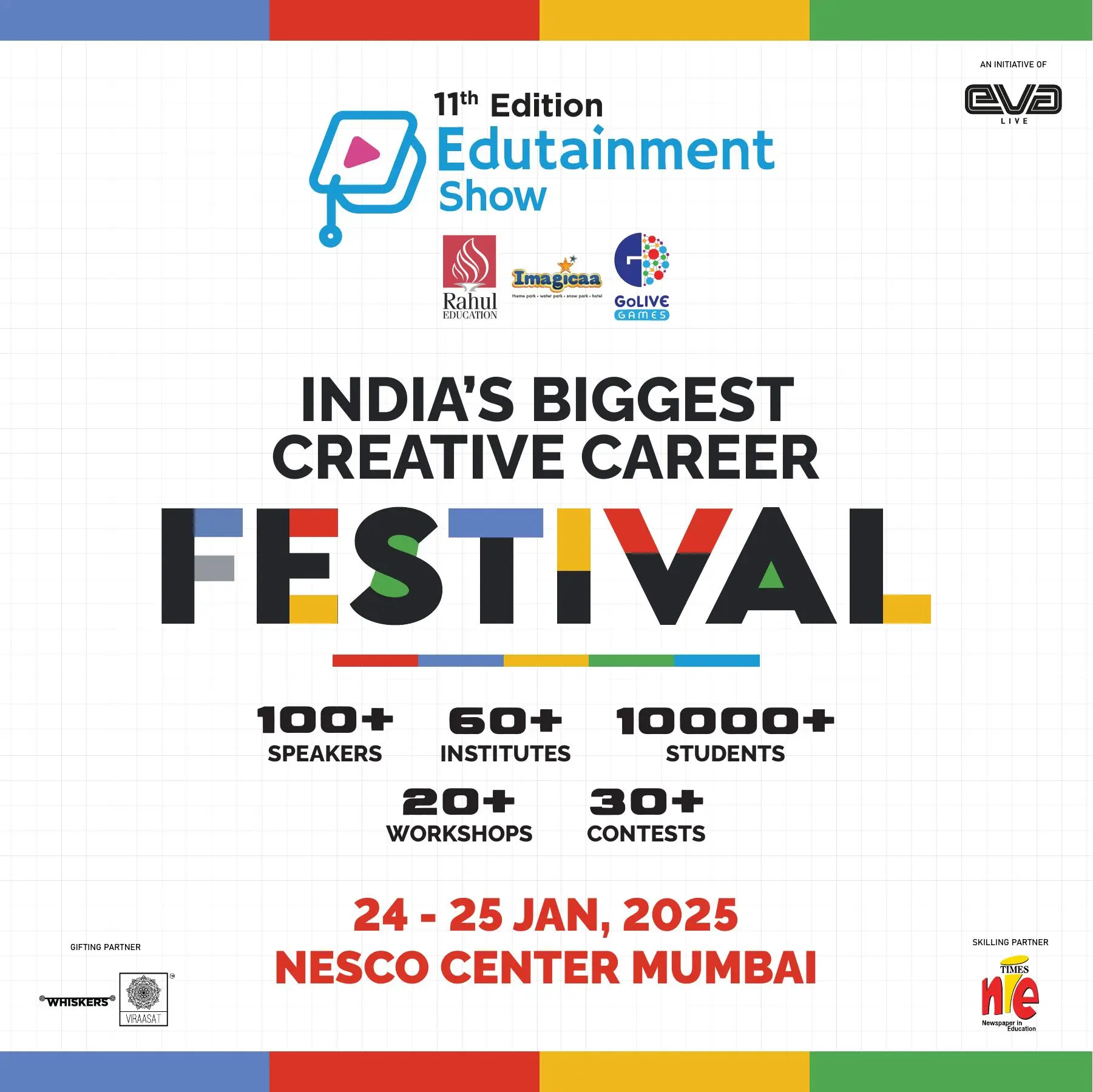
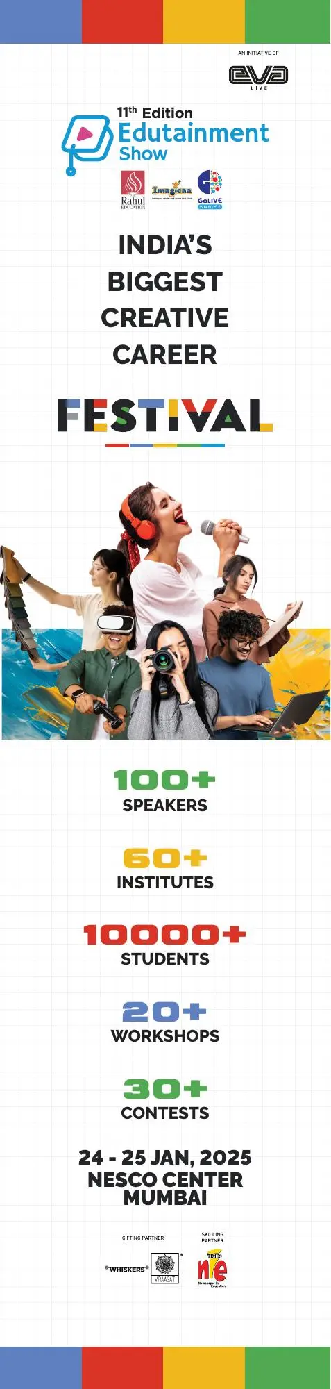
A graph-paper grid gave the system an educational backbone. Cyan, coral, yellow and green created energy, while bold black typography kept schedules, speakers and calls to action instantly scannable.
COLOUR.
CLARITY.
Each colour could lead a different content stream without breaking the overall event identity.
A CANVAS FOR
EVERY CREATIVE FUTURE.
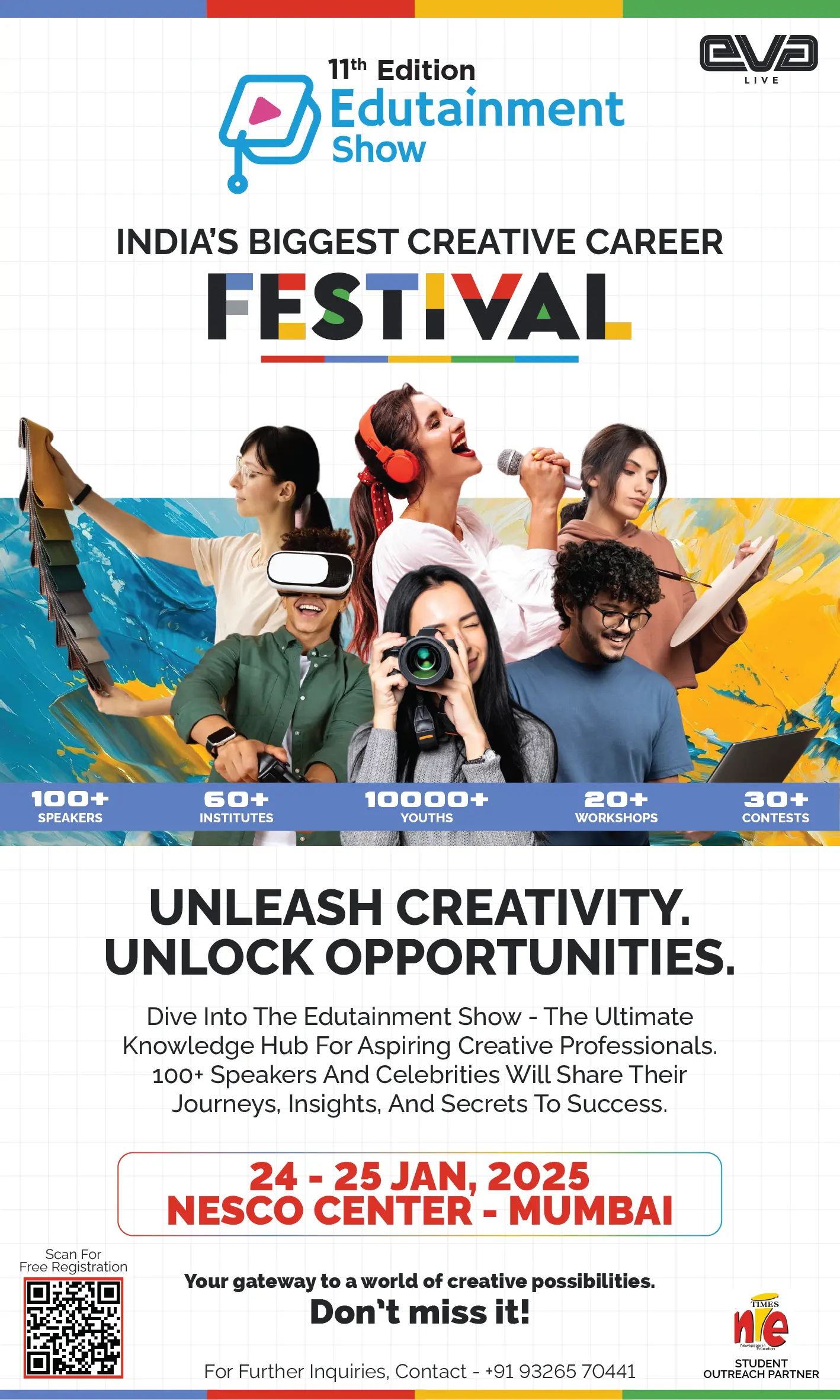
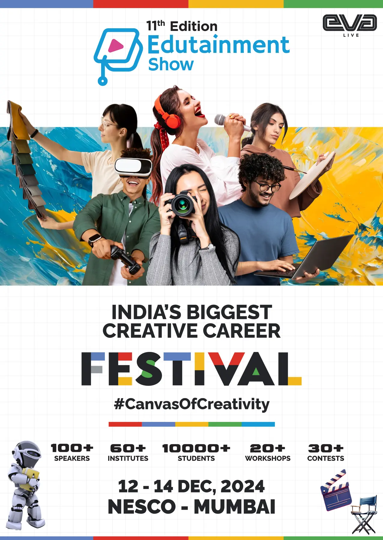
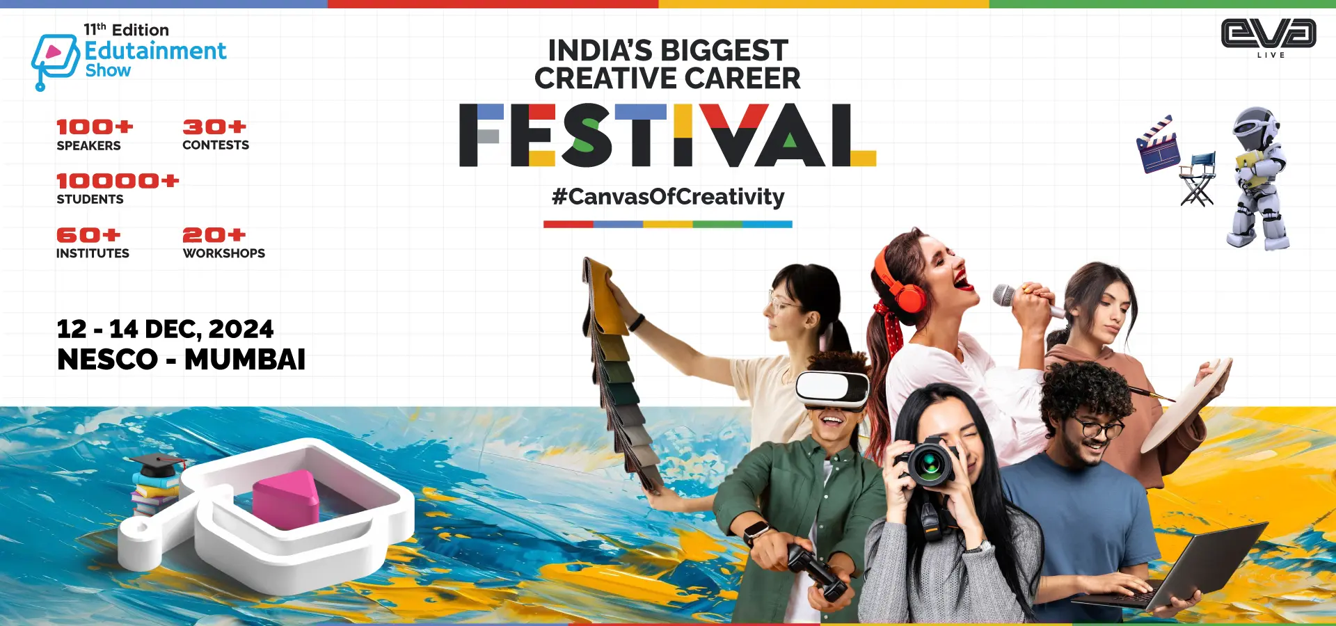
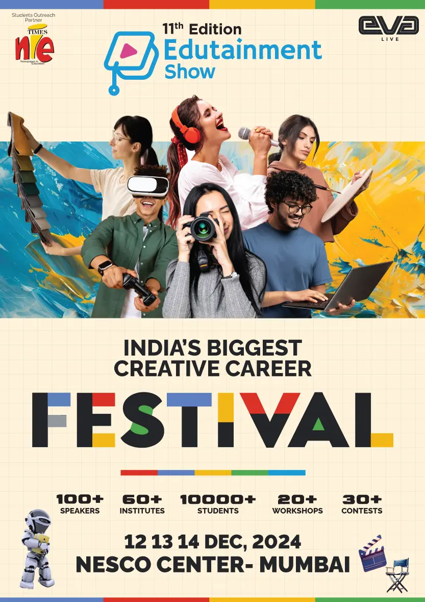
The central key visual brought fashion, music, film, photography, gaming and digital careers into one energetic world. It was built to move from portrait announcements to venue-scale landscape communication.
EVERY SESSION
GOT ITS
OWN SPOTLIGHT.
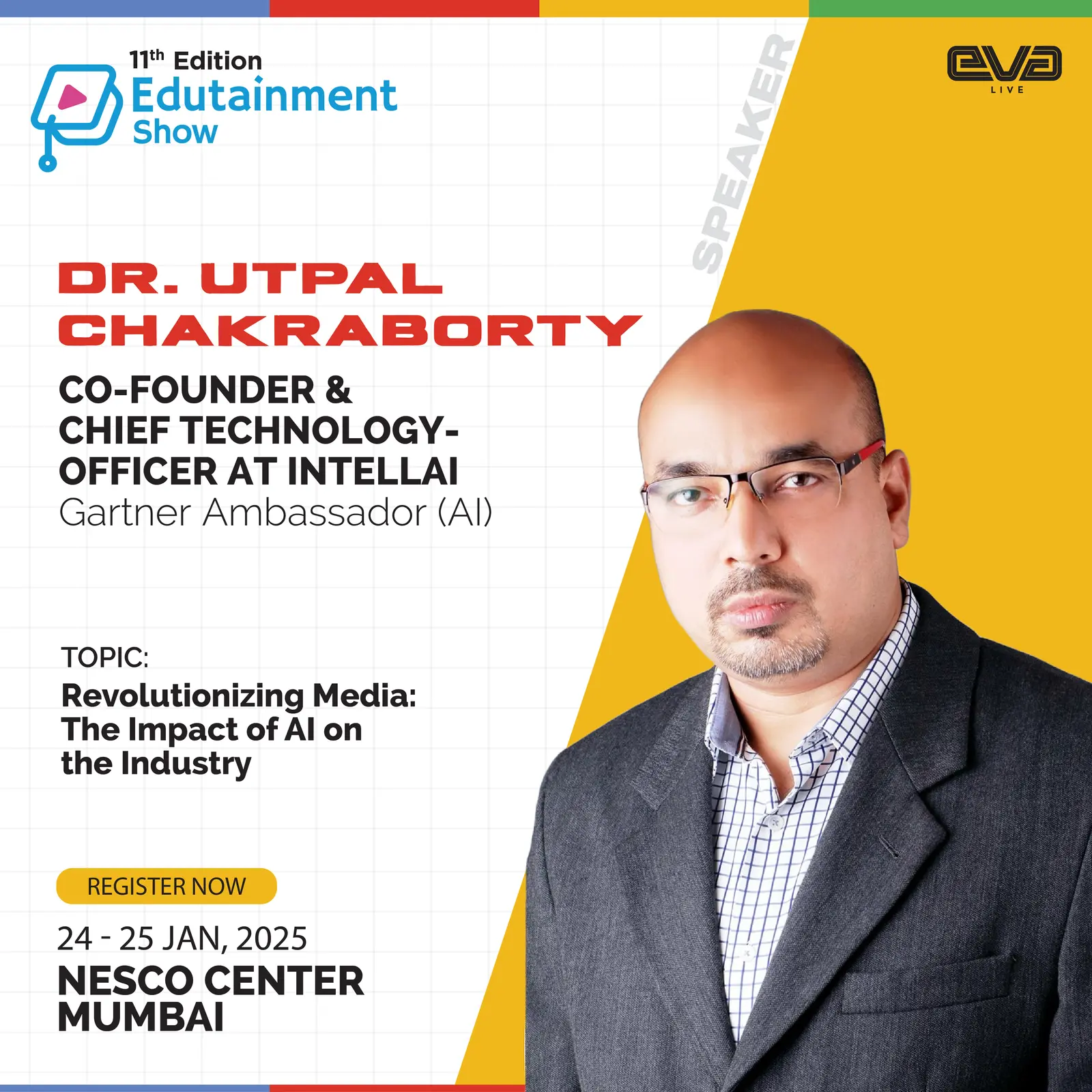
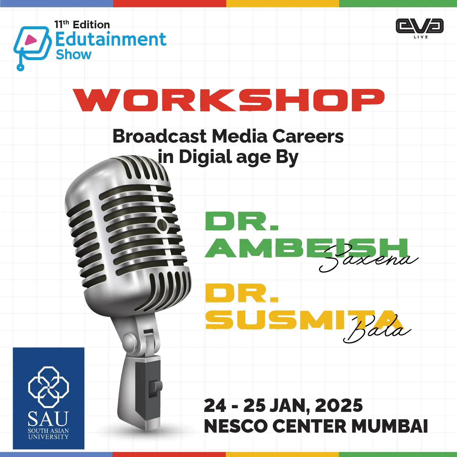
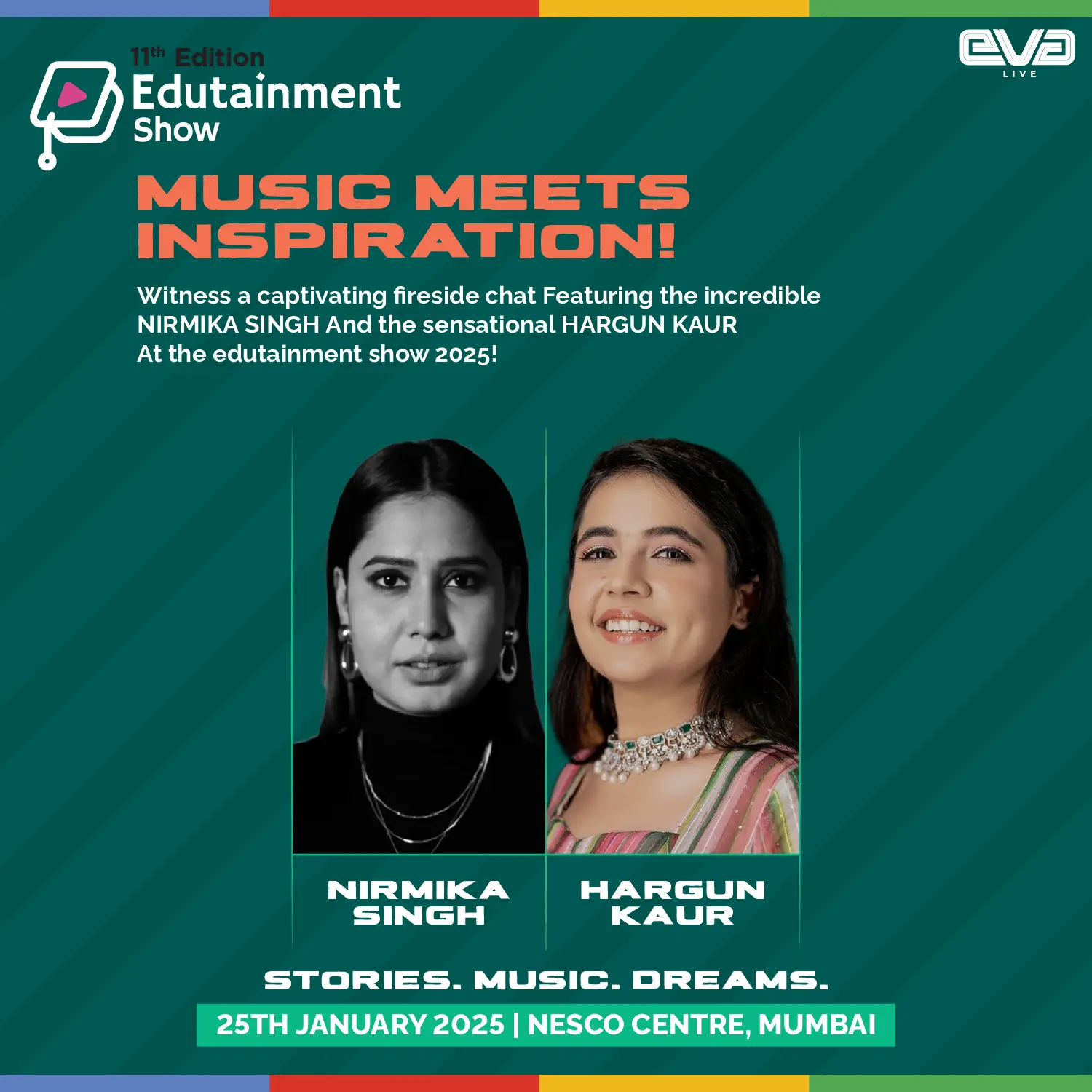
One strongest creative from each content stream—conference, workshop and panel—shows the range without repeating the same speaker or format twice.
MORE THAN
AN EVENT.
A PLATFORM.
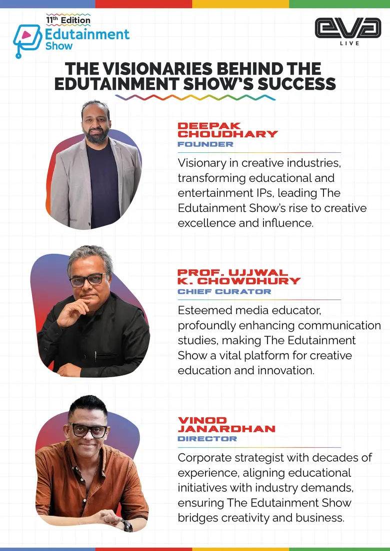
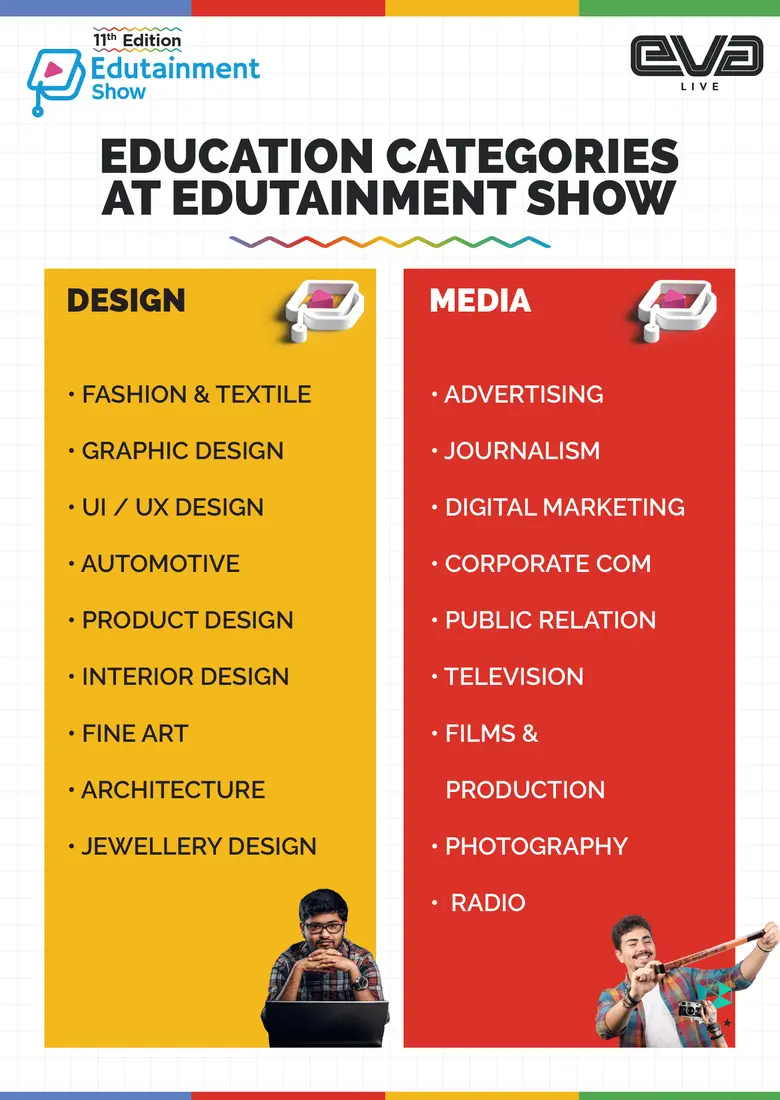
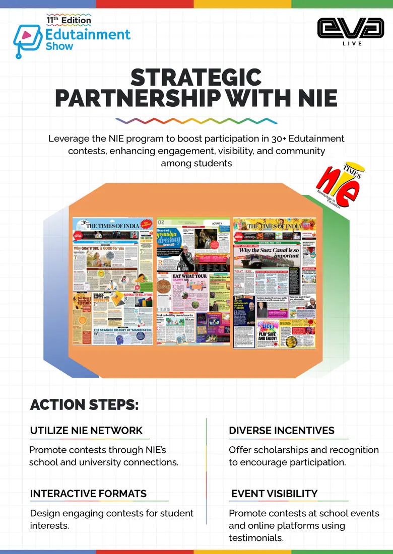
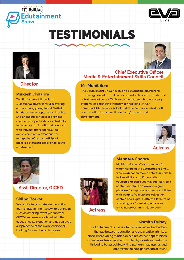
The wider communication system explained the vision, mapped the education categories, built institutional partnerships and carried stakeholder voices—turning the campaign into a credible education platform.
ONE BRAND.
A SECOND
STAGE OF PRESTIGE.
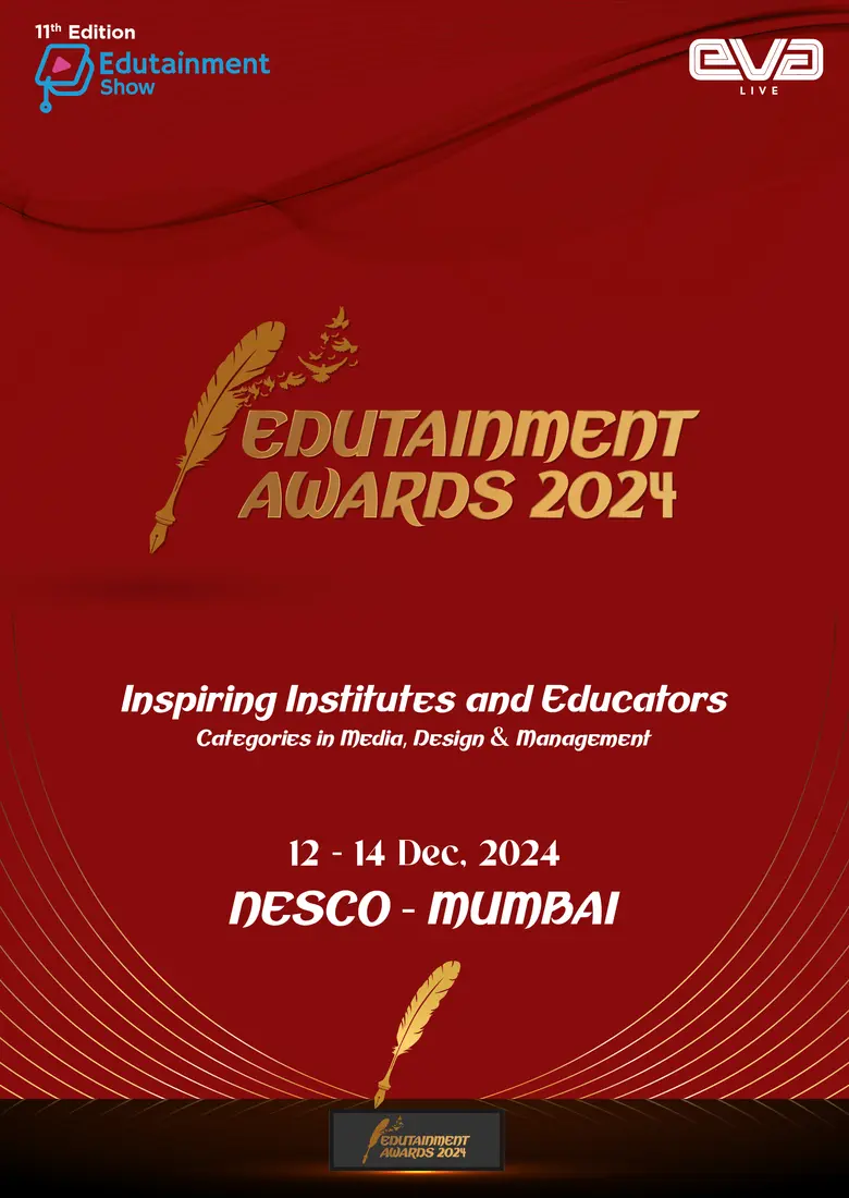
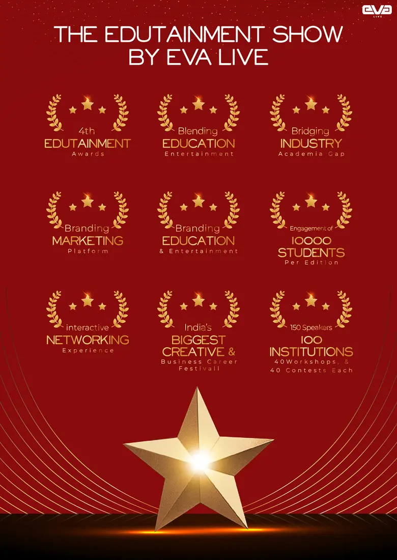
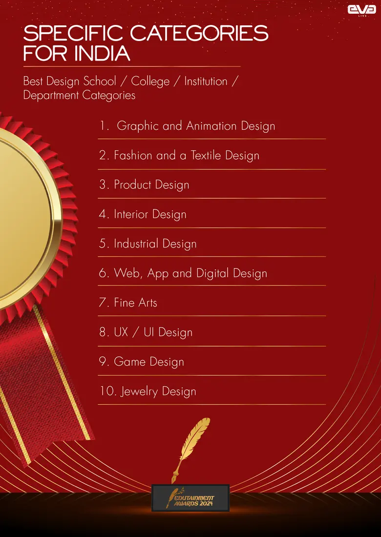
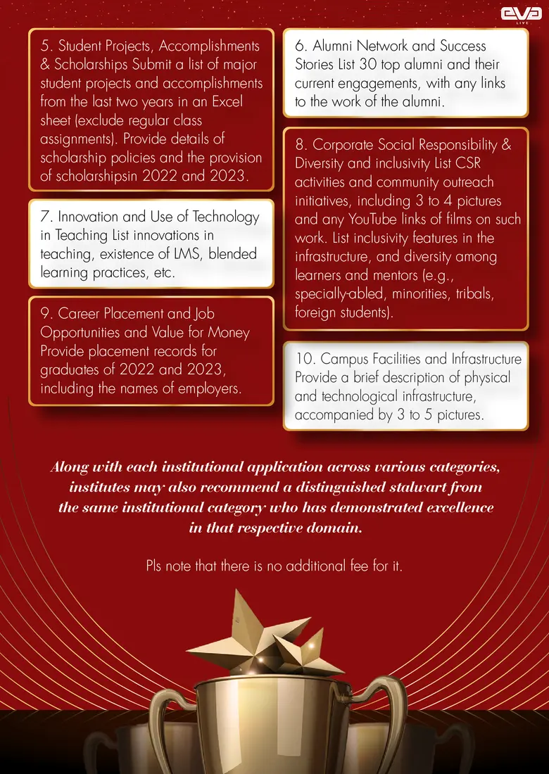
A dedicated awards identity extended the event into recognition—using a cinematic red-and-gold system across the launch, categories, judging criteria and programme communication.
FROM FIRST LOOK
TO FIRST
STEP INSIDE.
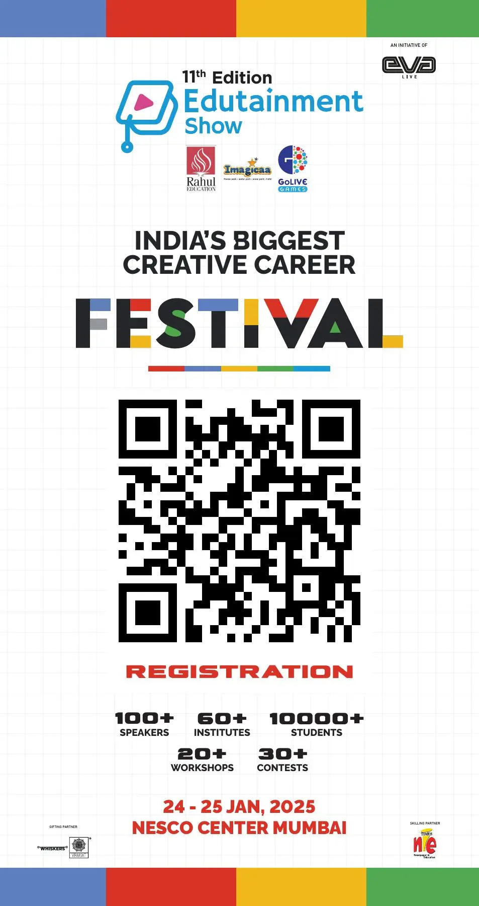
The Edutainment identity moved into a complete arrival journey—entrance architecture, registration fascia and action-led standees. This chapter now stays focused only on Edutainment.

INFORMATION.
RECOGNITION.
CONTROL.
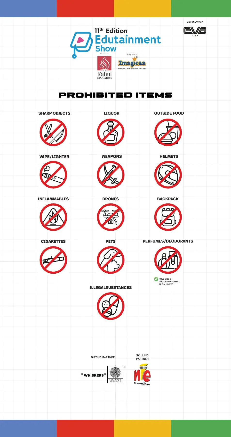
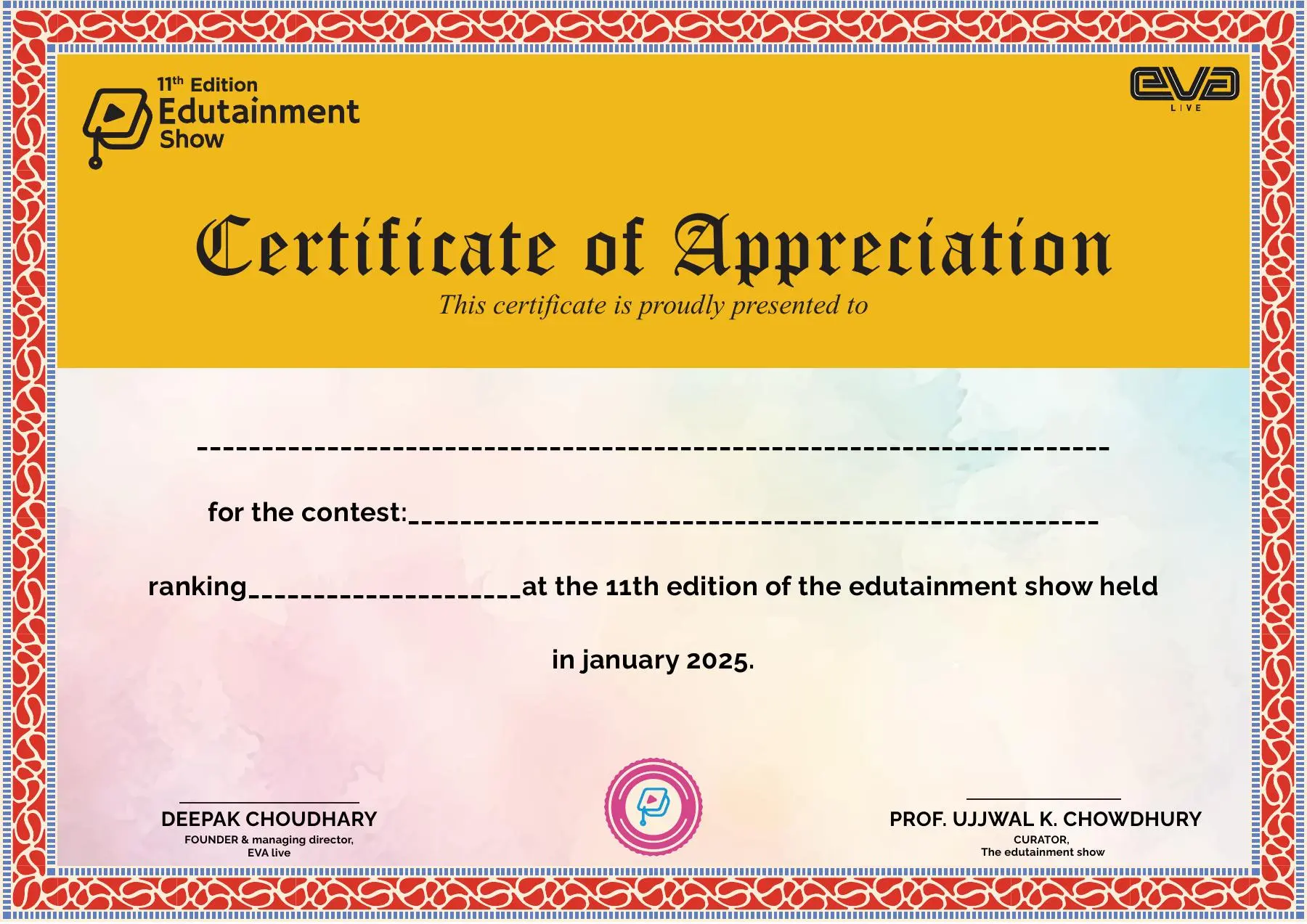
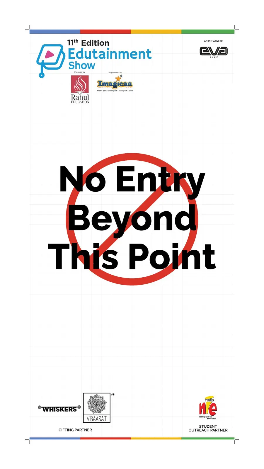
A deliberately different set of functional pieces—visitor information, certificates and access control—shows how the brand worked beyond promotional posters.
THE BRAND
SHOWED
THE WAY.
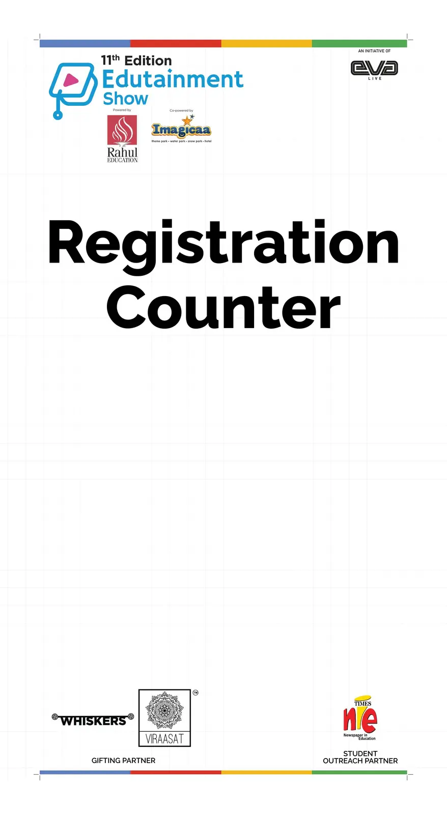
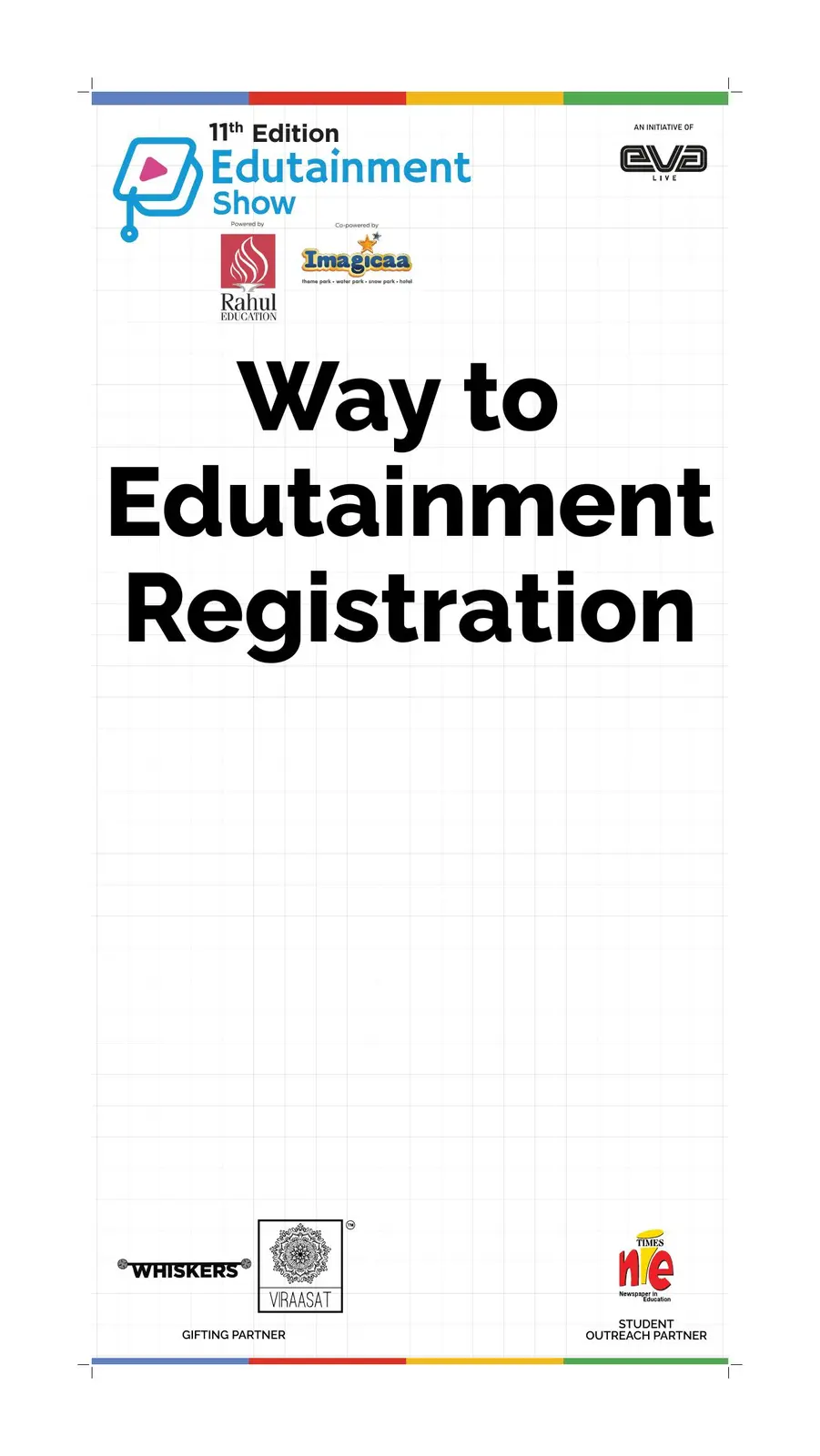
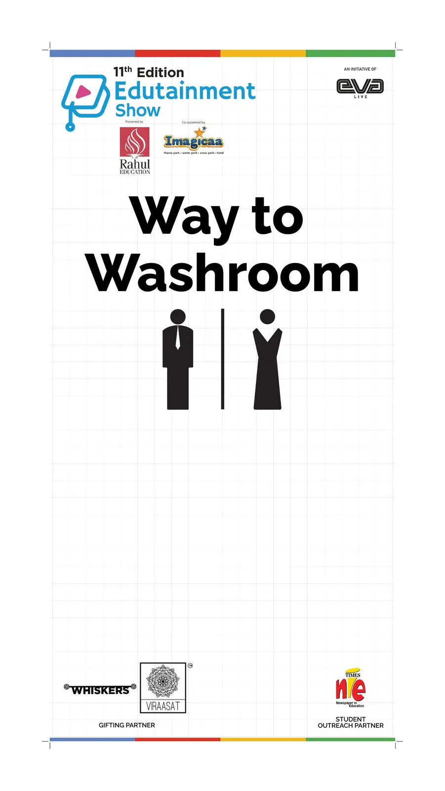
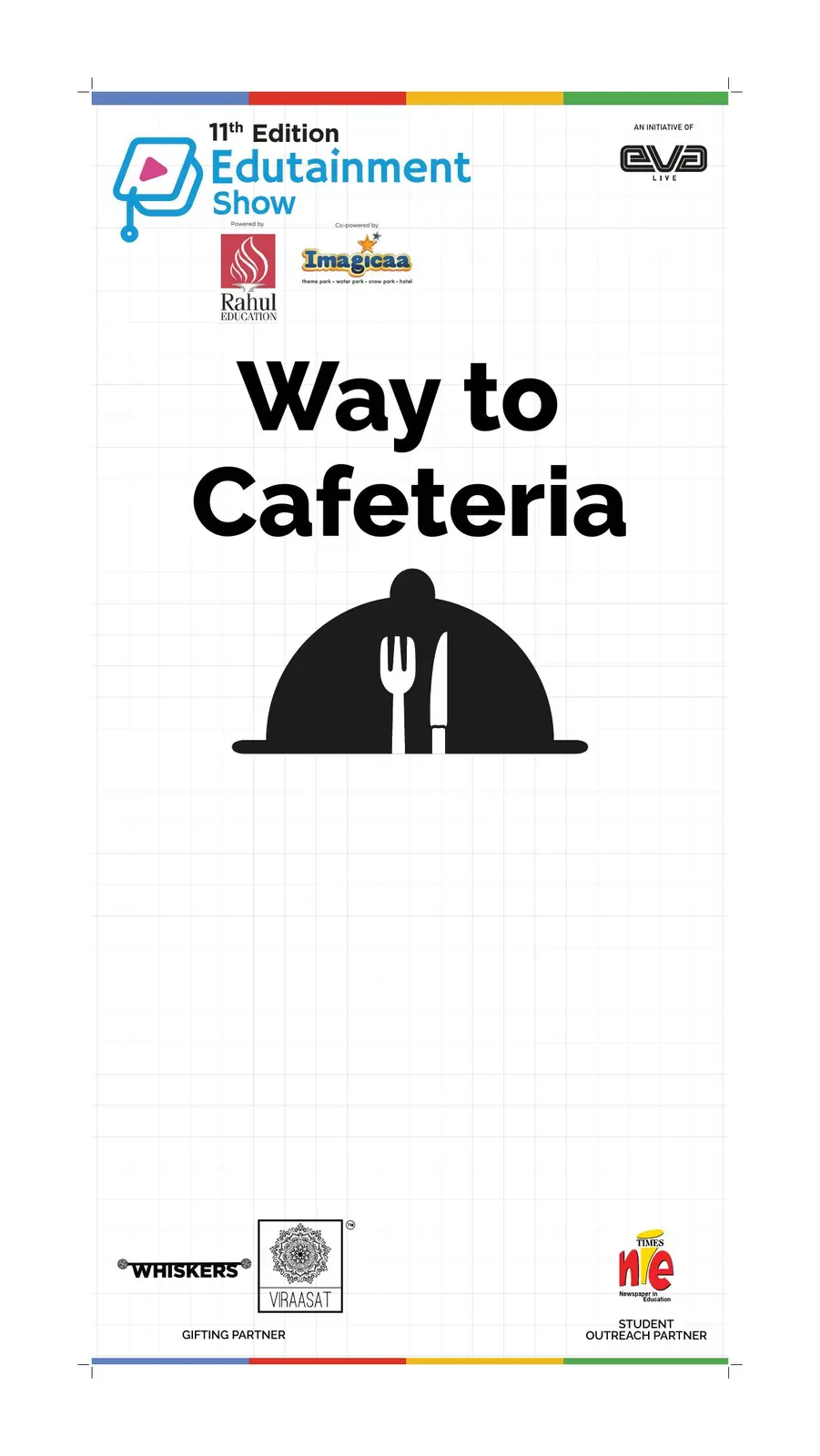
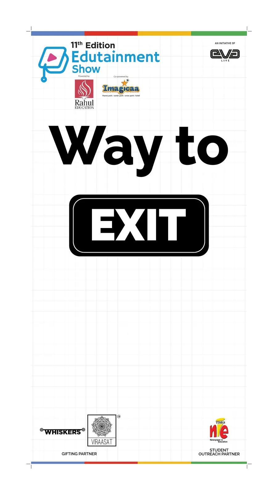
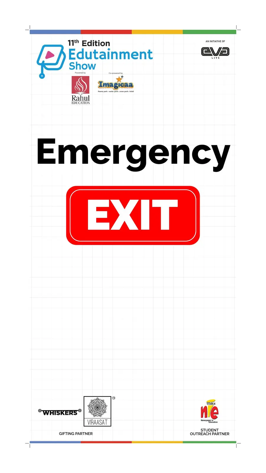
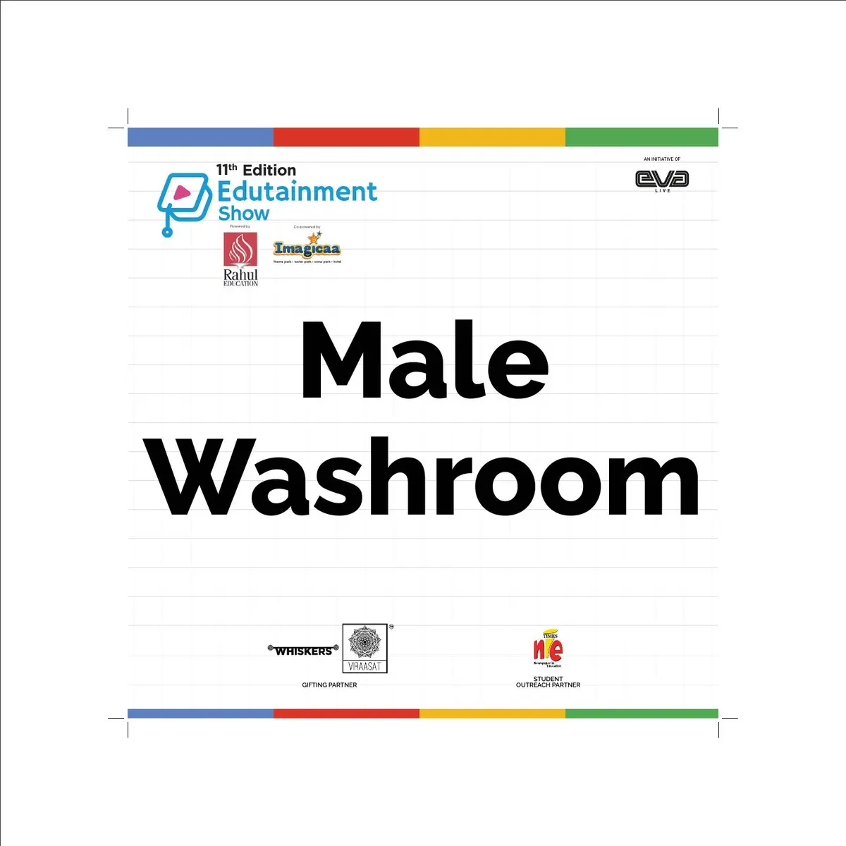
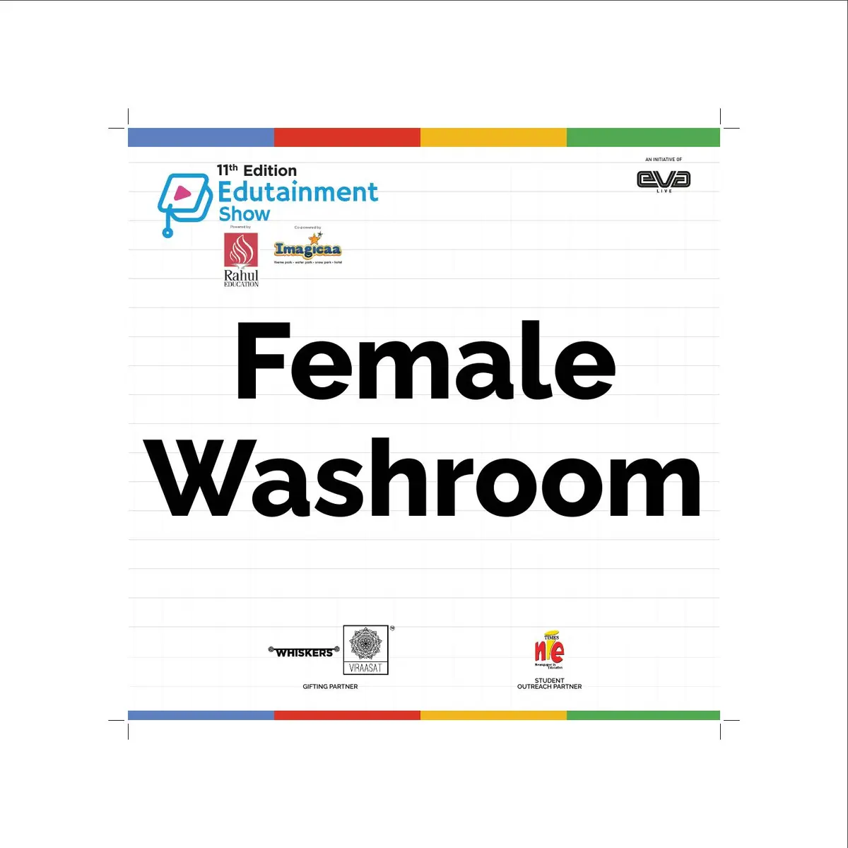
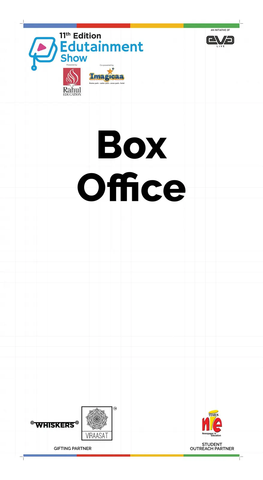
A modular signage family carried the identity through practical visitor moments—from registration and box office to wayfinding, washrooms and emergency exits.
DESIGNED
FOR THE
WHOLE FLOOR.
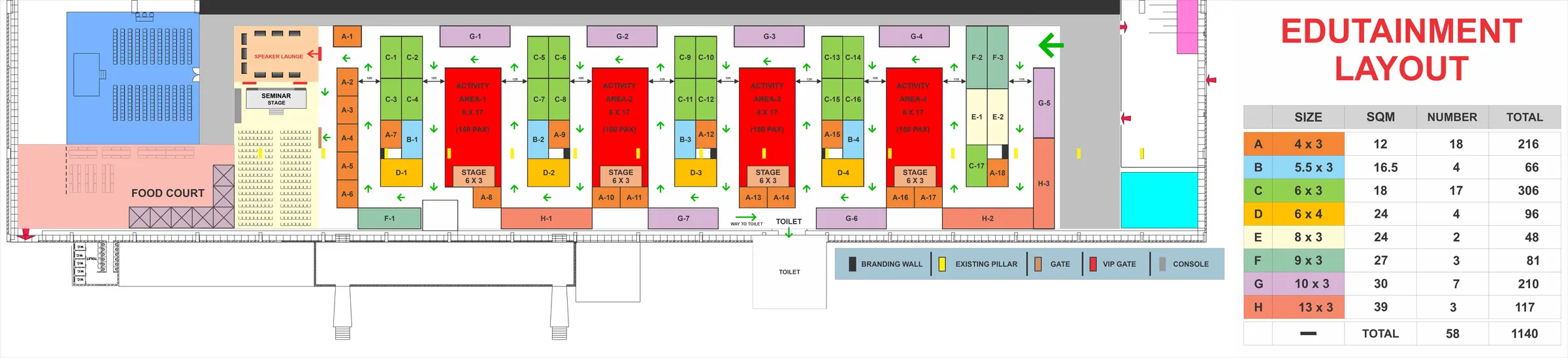
The visual system was planned alongside the real visitor journey: 58 exhibitor spaces, four activity areas, multiple stages, registration, speaker lounge, food court and directional flow.
FROM THE FEED
TO THE
MORNING PAPER.
The central festival message adapted into a print-first newspaper format without losing the pace or personality of the social campaign.
THE COMPLETE
SHOW SYSTEM.
One flexible identity, prepared for the full journey from discovery to the on-ground event.
- 01Campaign art direction
- 02Master key visual
- 03Event visual identity
- 04Contest communication
- 05Speaker announcement system
- 06Workshop & panel creatives
- 07Social content rollout
- 08Awards identity
- 09Awards communication deck
- 10Institutional partnership pages
- 11Entrance arch system
- 12Registration experience
- 13Visitor information
- 14Certificate design
- 15Print advertising
- 16Venue planning
- 17Wayfinding & signage
MAKE LEARNING
FEEL ALIVE.
From the first reveal to the last directional sign, every touchpoint made the experience easier to find—and harder to forget.
Start a project